Component tour
This page shows each built-in building block once, with the declaration that asks for it and a link to it in the component library, where you can switch between the seven looks, light and dark.
The library is Storybook, built with this site. Each story draws the real
component from src/client/components over fixture data, with no server
behind it. The pictures here are in Mono, the default look. The Look and Mode
buttons in the library’s toolbar dress any story in the others.
A list view is a grid unless its presentation says otherwise. The rows, the
filters and the permissions don’t change with the presentation. See
lists and
list views.
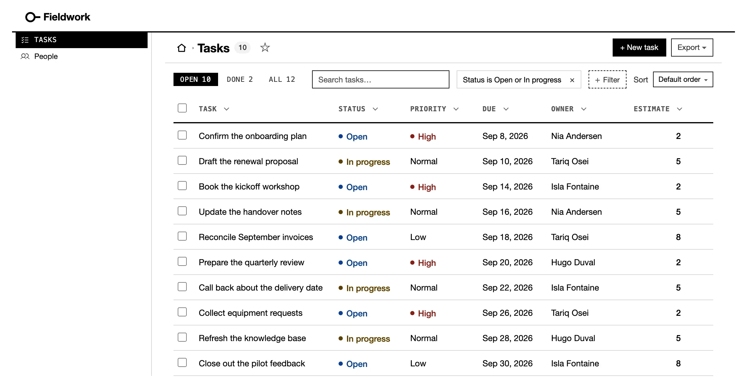
listView('Tasks', 'task', { show, tabs, filters }) · Open in the library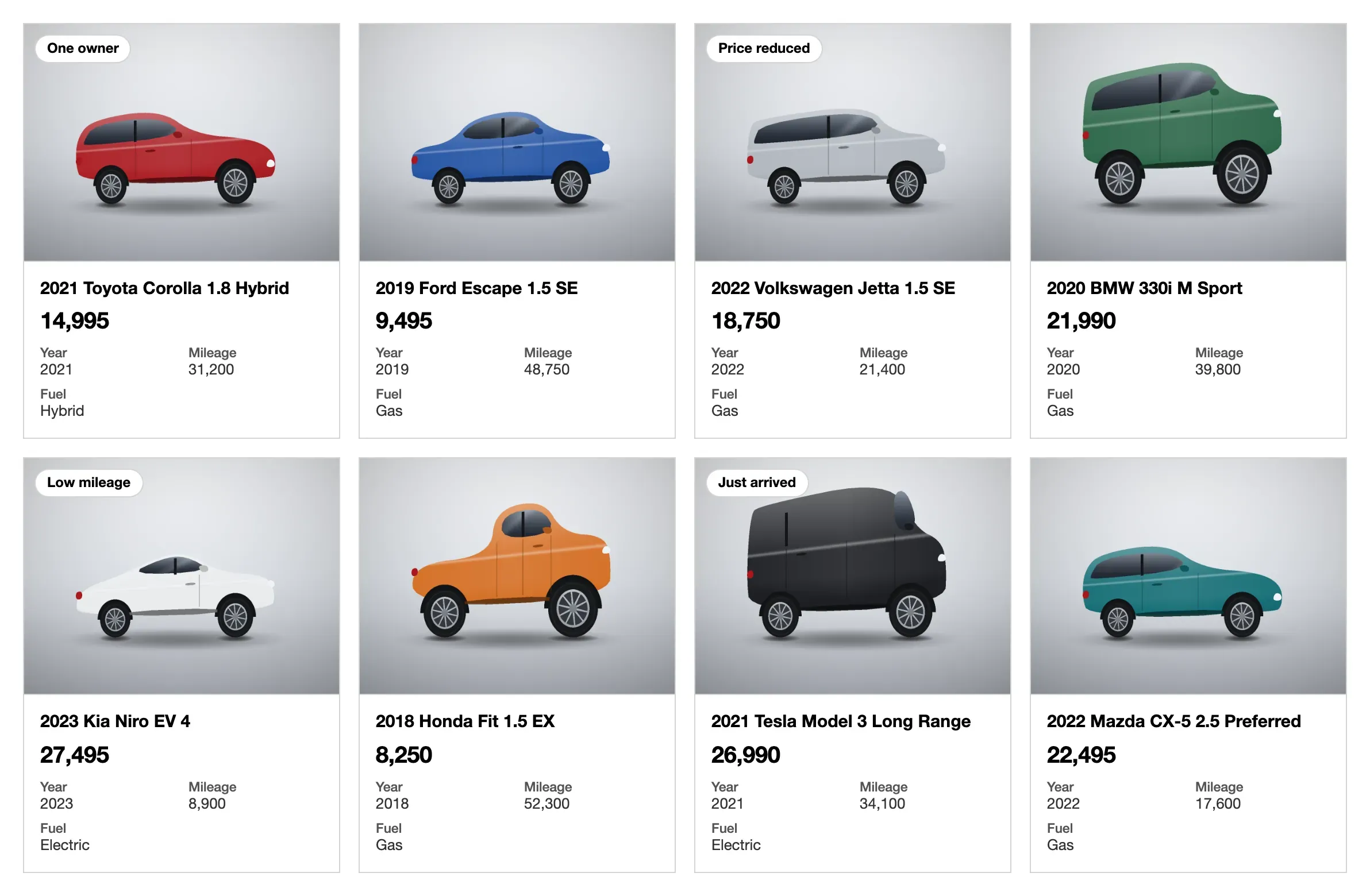
cards('title', { value, facts, image }) · Open in the library
queue('title', { badge, lines, facts }) · Open in the library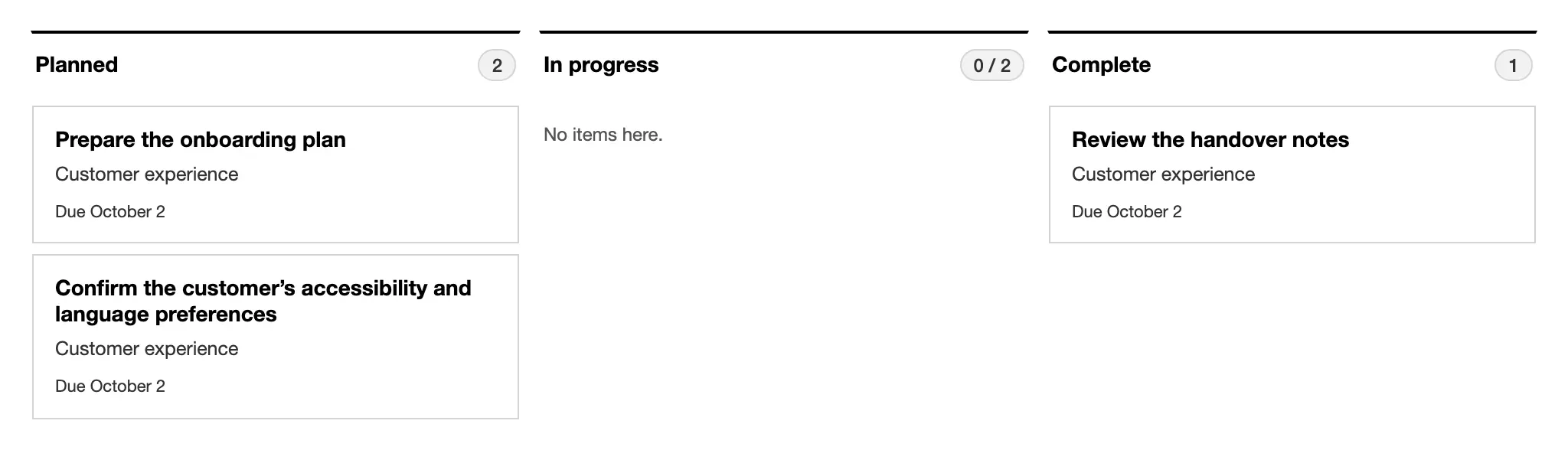
{ kind: 'board', by: 'status', primary } · Open in the library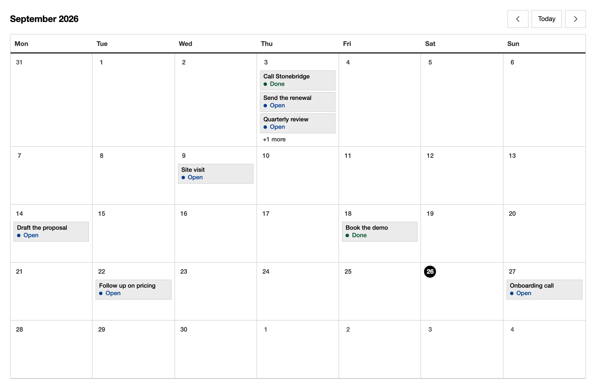
end. calendar('due_on', 'title') · Open in the library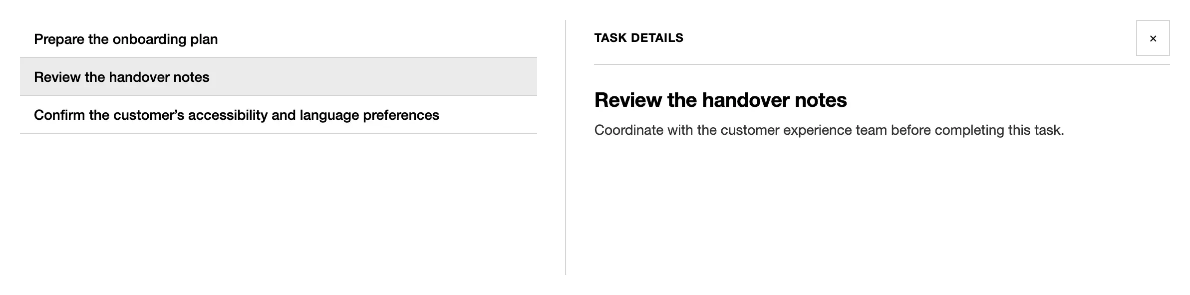
{ kind: 'split', detail } · Open in the libraryRecords
Section titled “Records”A record page is a list of sections. See record pages.
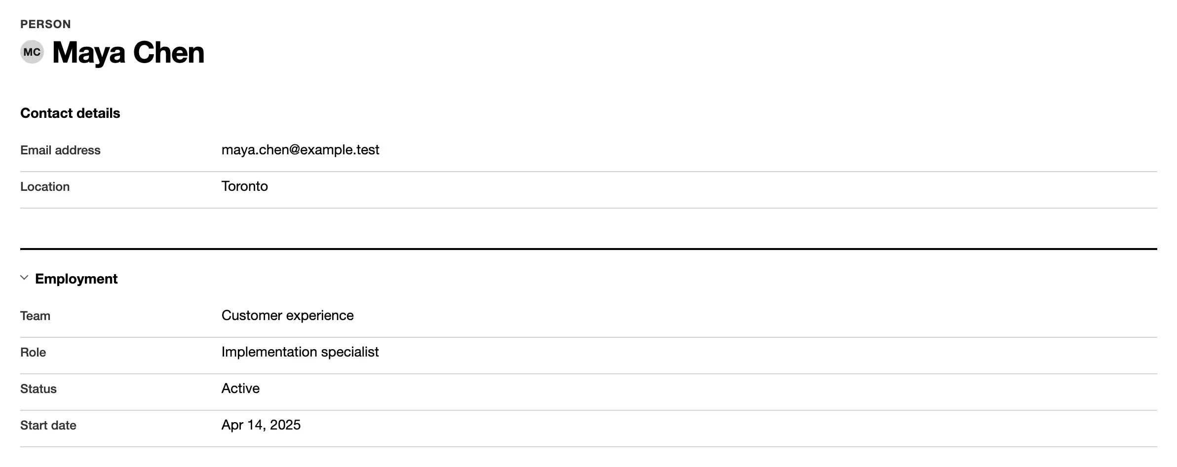
fields(['name', 'status'], { title: 'Details' }) · Open in the library
related('Invoices', 'invoice', 'account_id', { show }) · Open in the library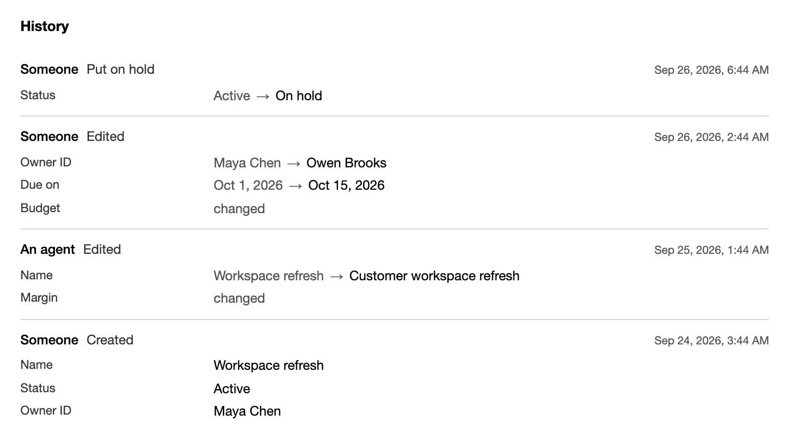
history() · Open in the library
fields(['status'], { workflow: workflow('status', steps, { ordered: true }) }) · Open in the libraryDashboards
Section titled “Dashboards”A dashboard is a list of sections about whole tables. On a record page, the
same helpers take whose and count only the rows that point at that record.
See dashboards.

metric('Open tasks', 'task', { query, better: 'down' }) · Open in the library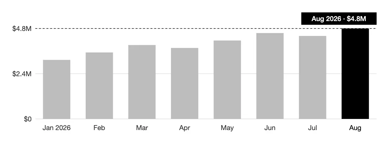
chart('Created', 'task', 'month created_on', { shape: 'bar' }) · Open in the library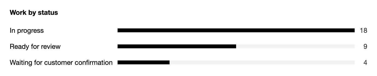
breakdown('Work by status', 'task', 'status') · Open in the library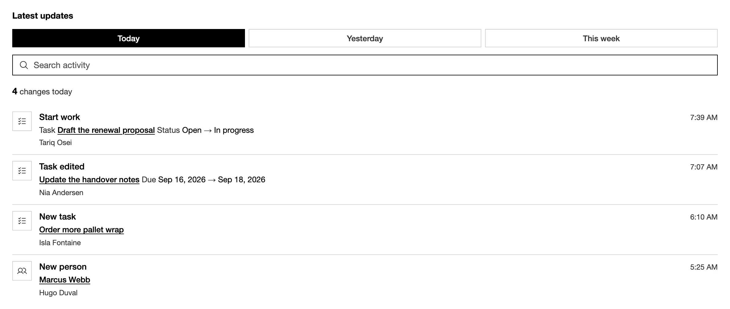
activity('Latest updates', { task: { icon: 'list-checks' } }) · Open in the library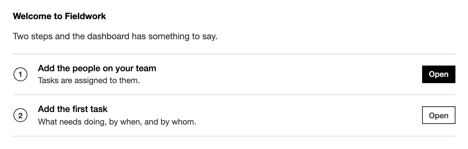
firstRun('Welcome', [{ label, view }]) · Open in the library
ui: { theme: { preset: 'tray' } } · Open in the libraryForms and commands
Section titled “Forms and commands”The New form comes from the resource. A command’s form comes from its declared inputs. See forms and command forms.
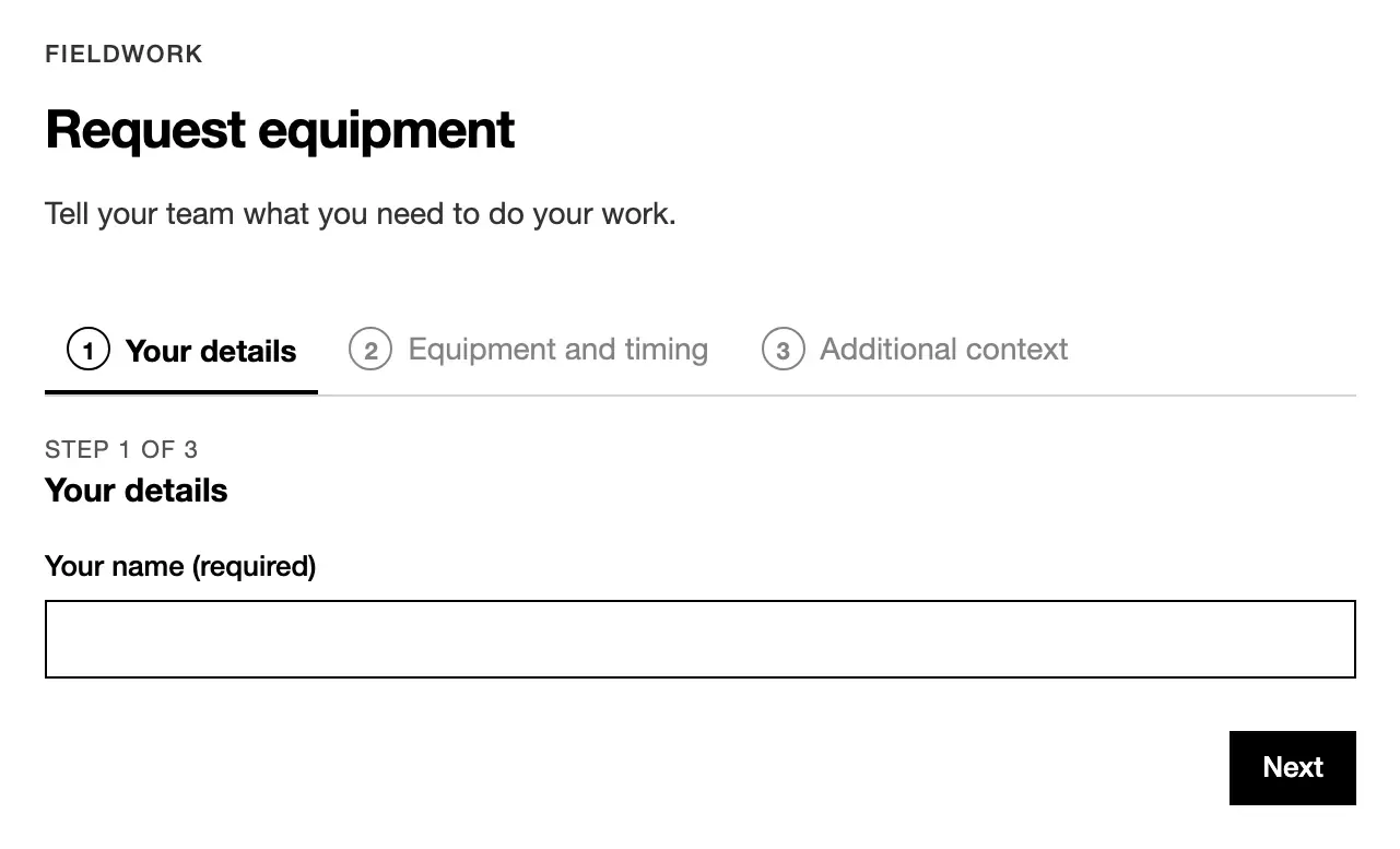
commandForm('Request', ref, [step('About you', [...])]) · Open in the library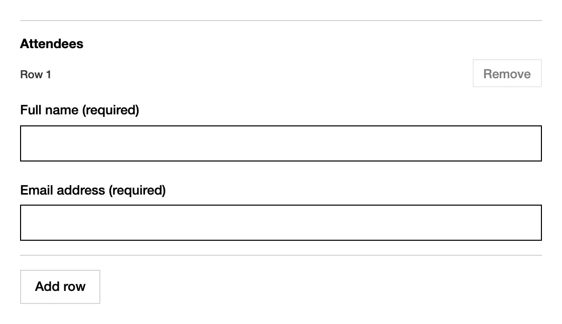
field.group({ … }, { repeat: { min: 1, max: 30 } }) · Open in the libraryChrome
Section titled “Chrome”The sign-in screen, the account menu and the bell come with auth. You don’t
declare them. See sign-in, roles & data.
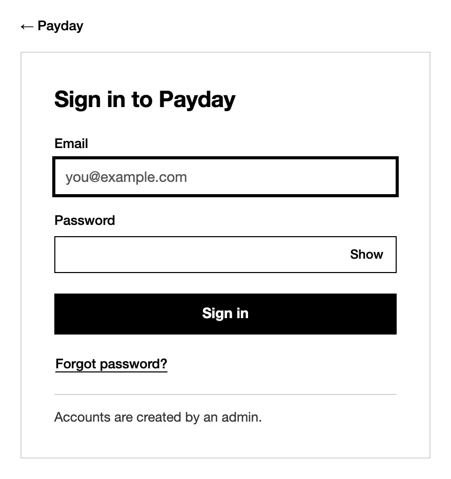
auth: { providers: ['email'] } · Open in the library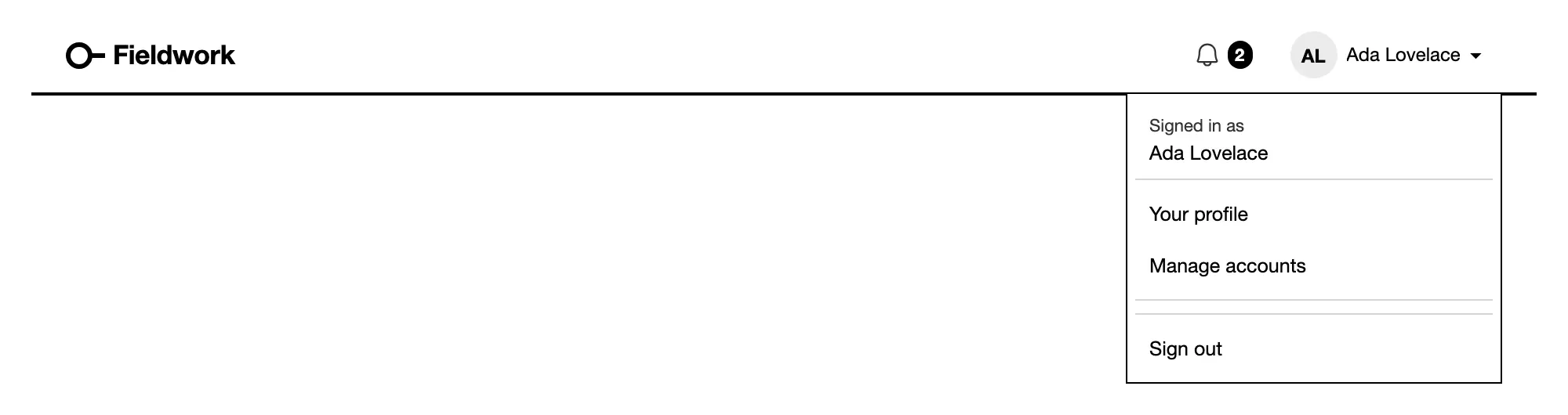
admin. · Open in the library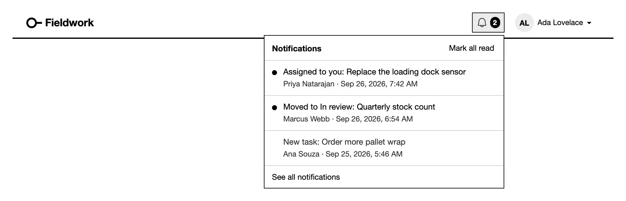
notify rules. · Open in the libraryCustom components
Section titled “Custom components”Where no built-in fits, an App draws its own with a React module and
tablewalk/ui. Each sample module’s examples are also stories in the
library, under Sample Apps. See
custom components.
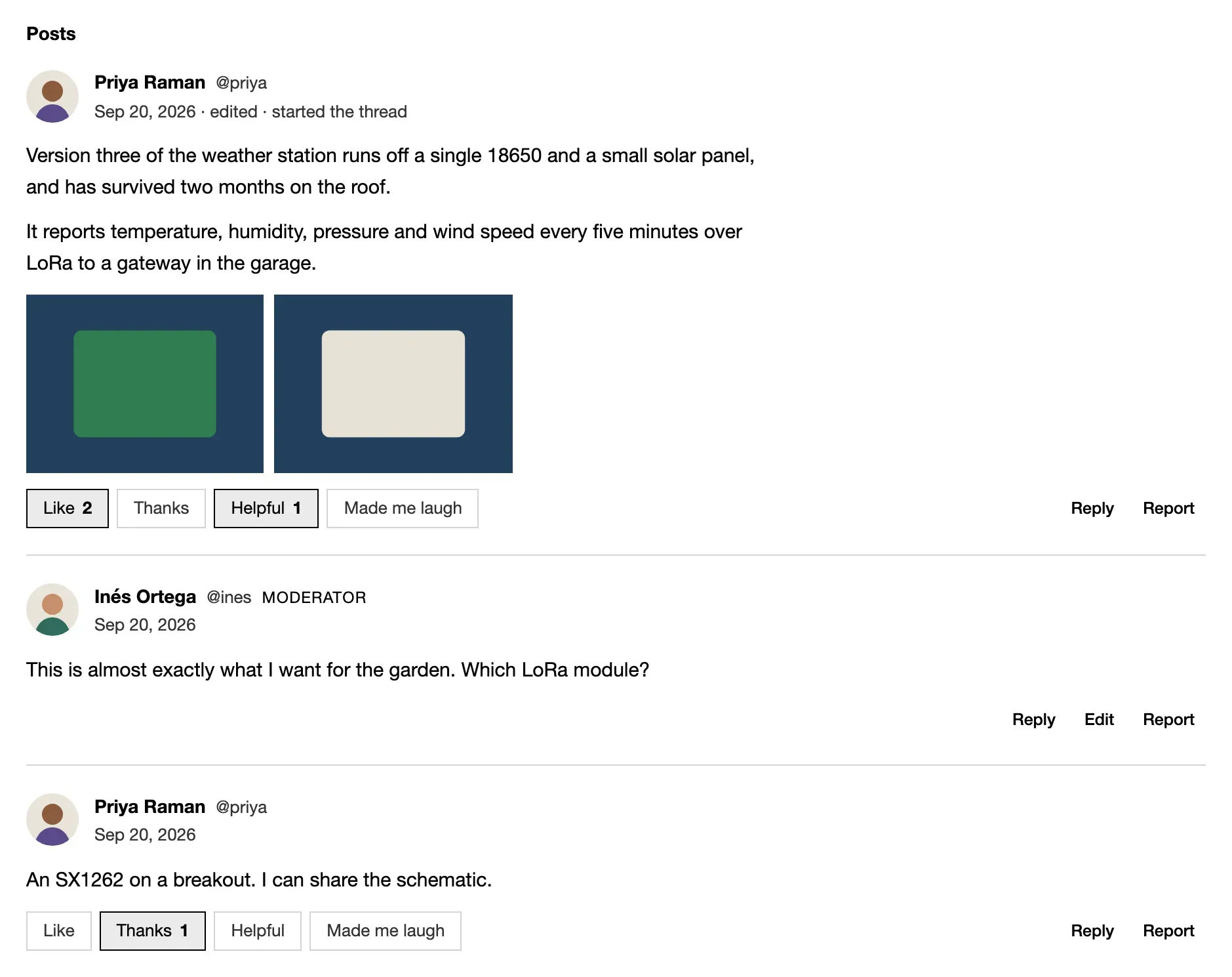
customList(postStream, { show }) · Open in the library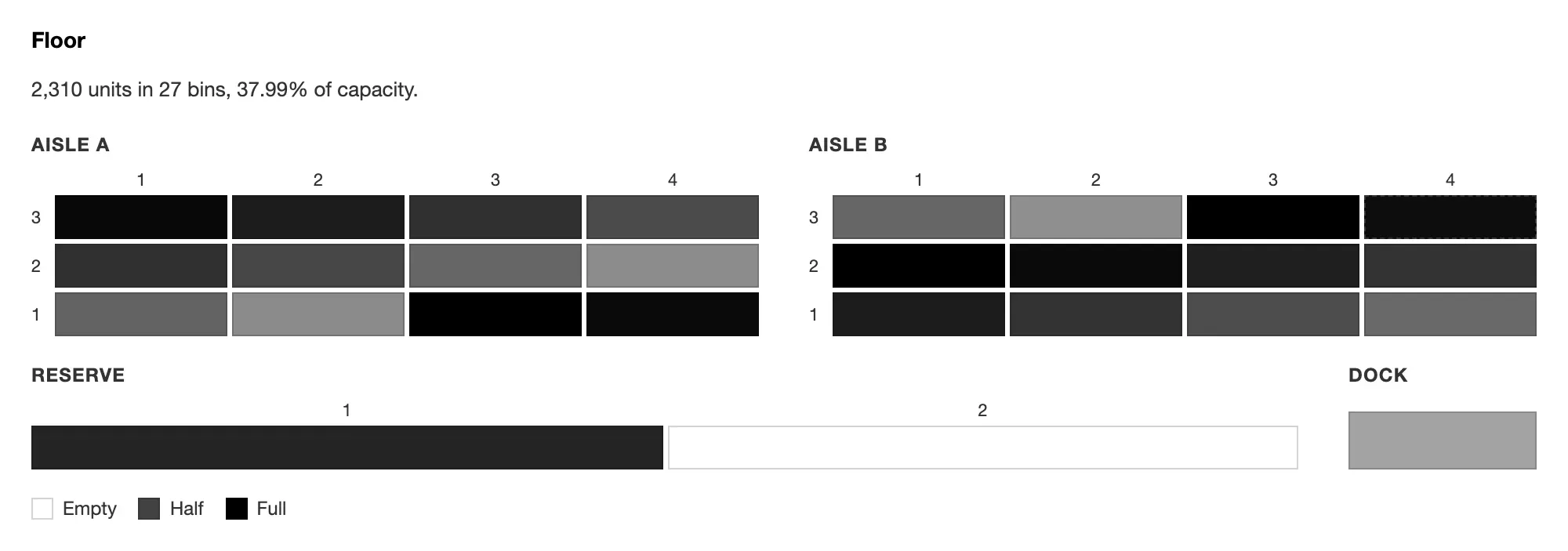
custom('Floor', binMap, { rows }) · Open in the libraryRun the library locally
Section titled “Run the library locally”npm install && (cd storybook && npm install)cd storybook && npm run dev # http://localhost:6006npm run build:site builds it into site/dist/components/.