Looks
This page shows the seven built-in looks and how an App picks, adjusts or adds one.
ui: { theme: { preset: 'canvas' } },Every look shares one structure and type scale, in light and dark; they differ in colour, face and corners. A look changes how an App reads, never what it shows or who may change it. The database browser and the Workbench keep their own look.
The seven, side by side
Section titled “The seven, side by side”Thread’s Issues list in each look. See every component in every look in the component showcase.
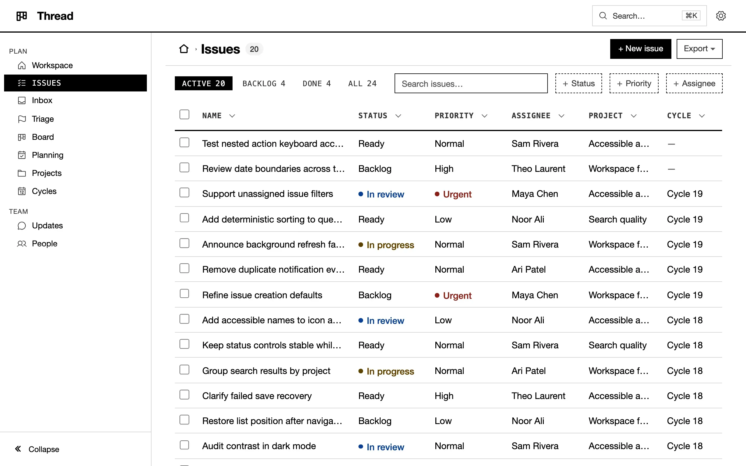
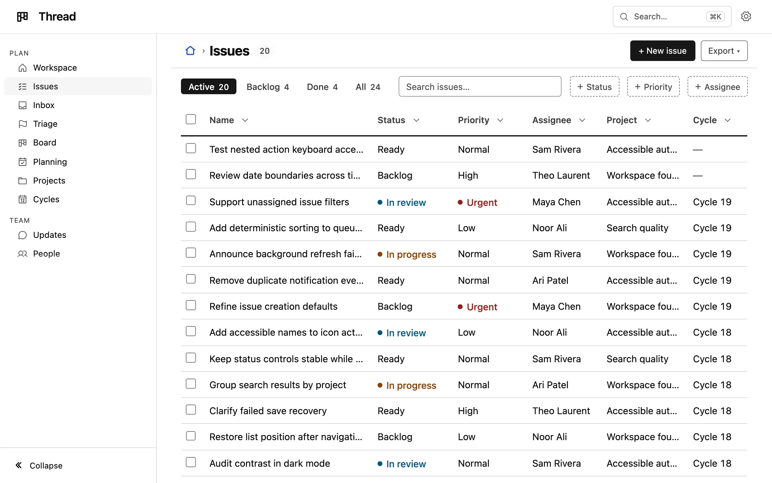
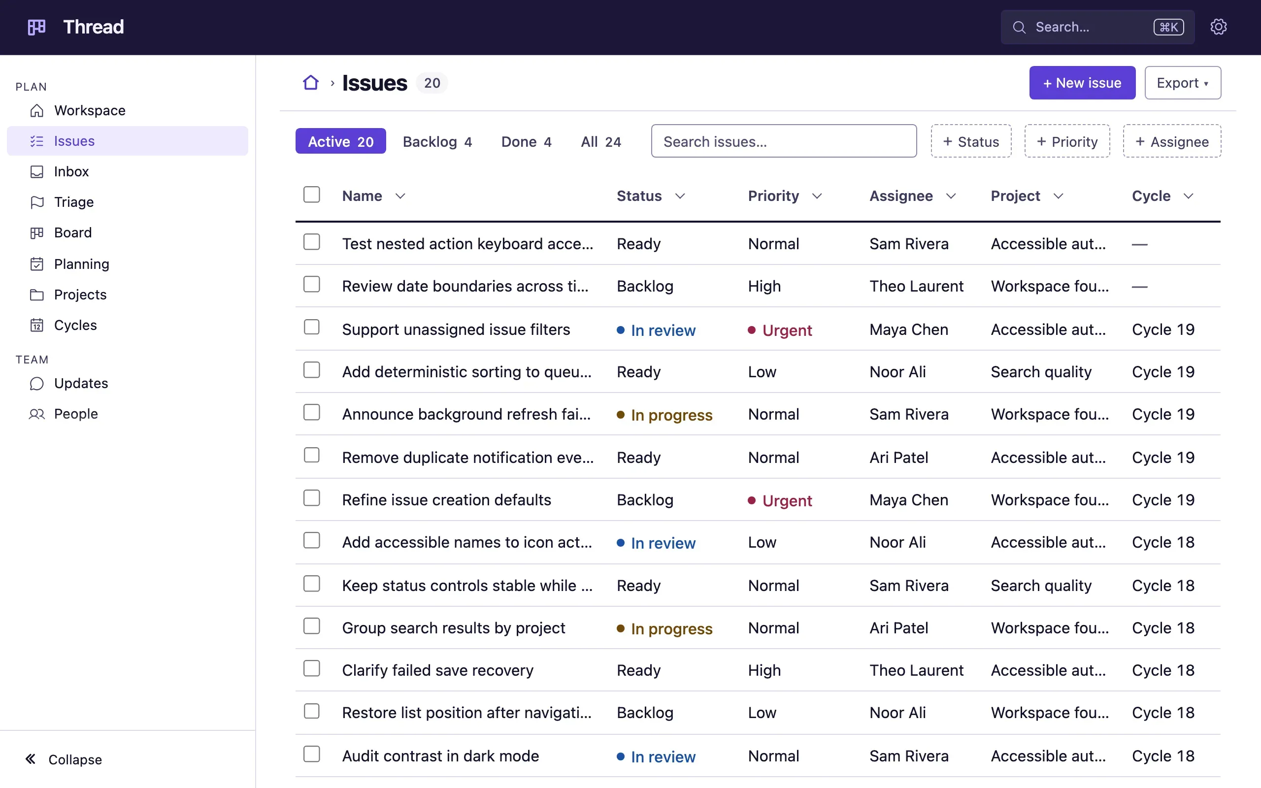
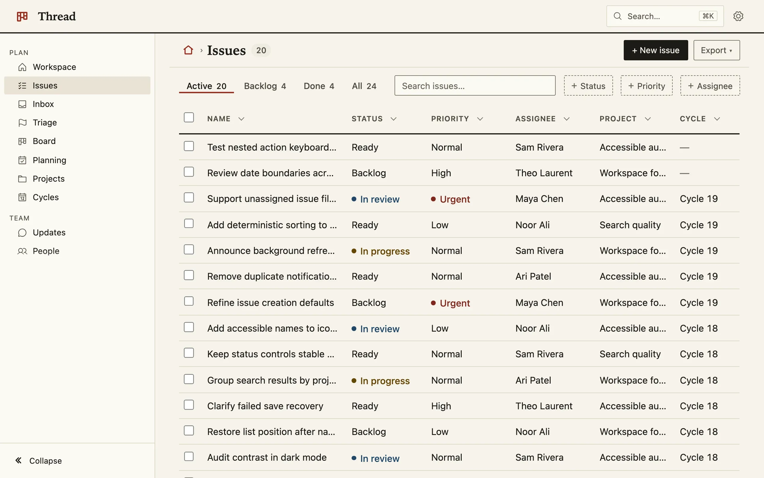
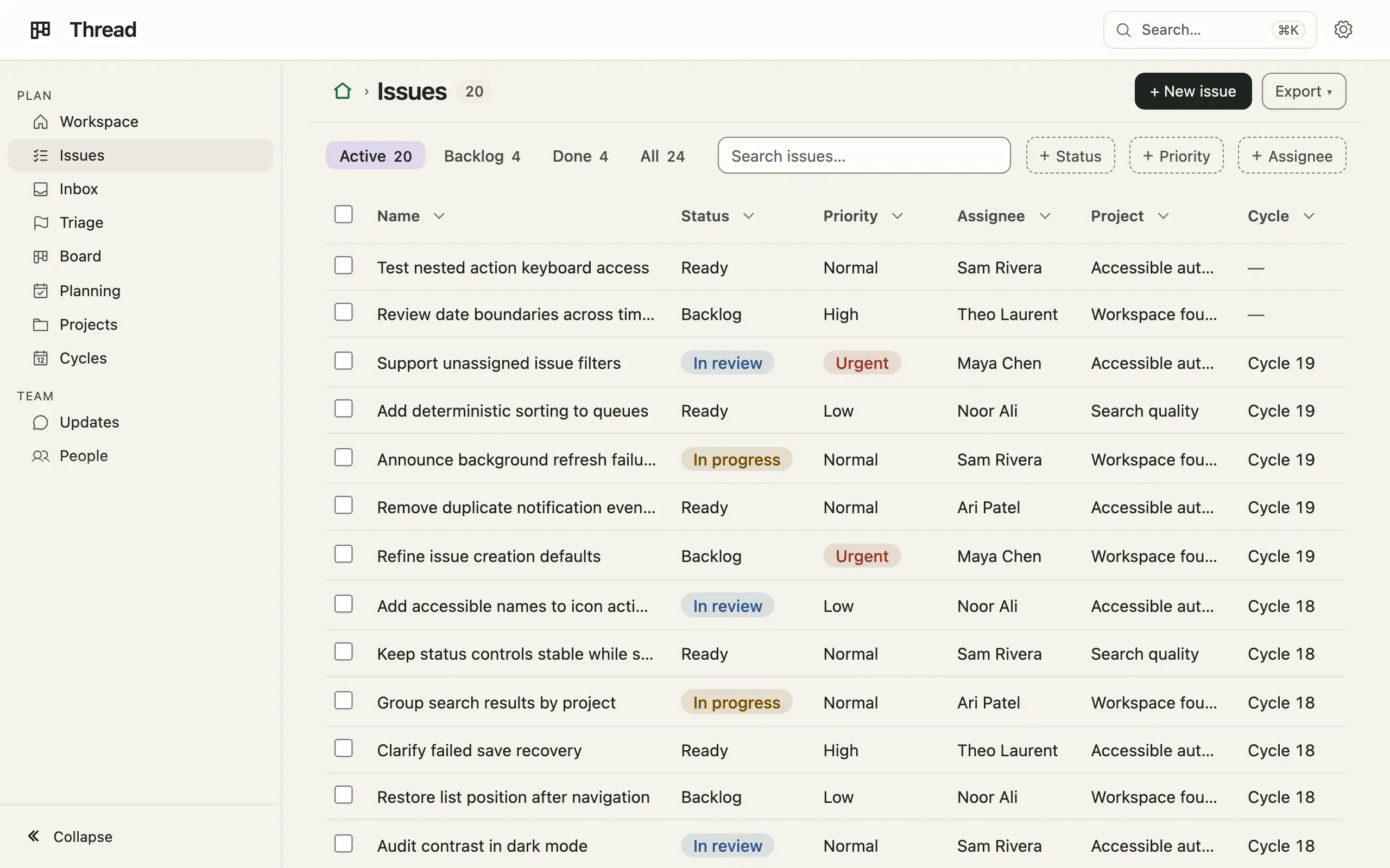
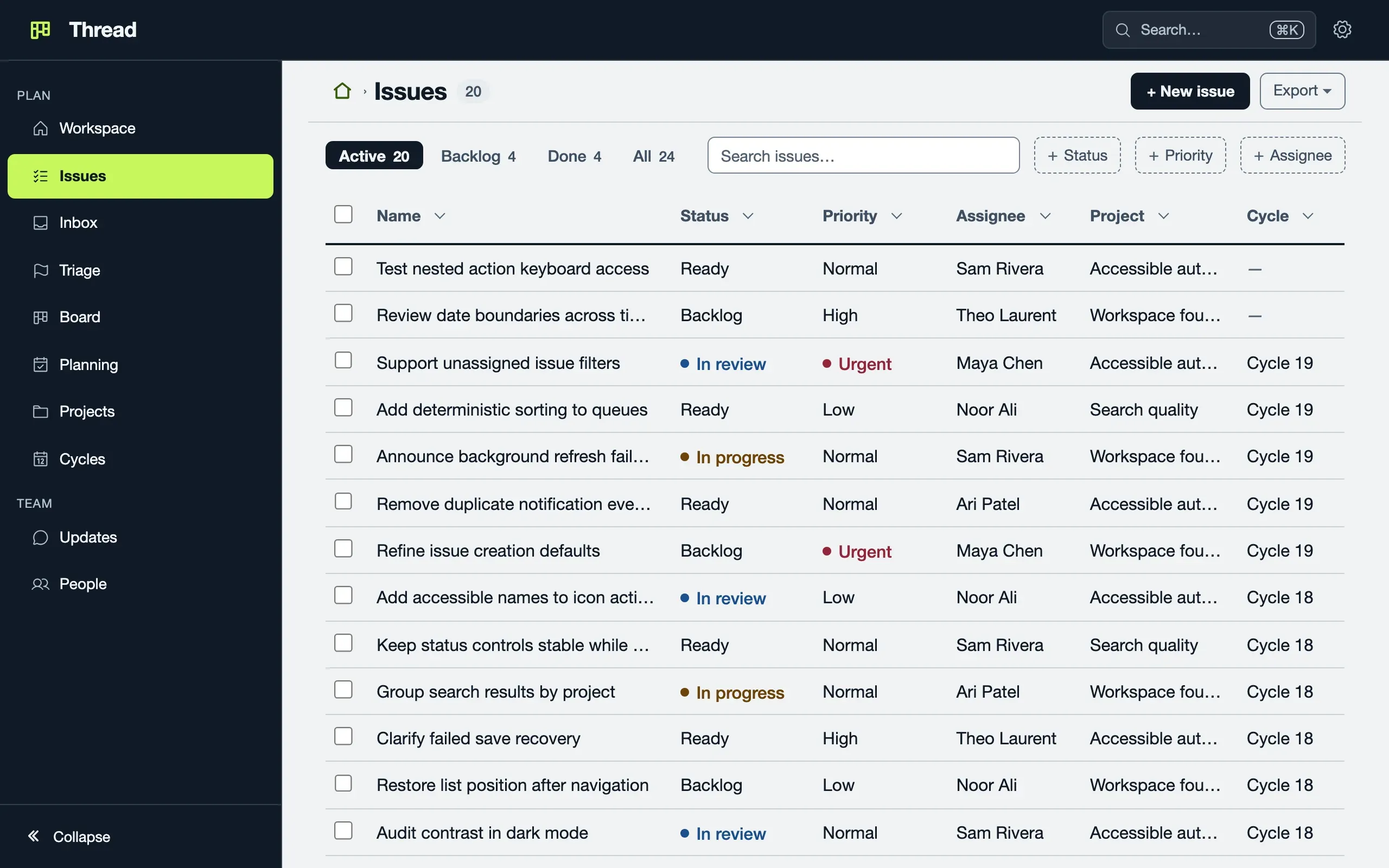
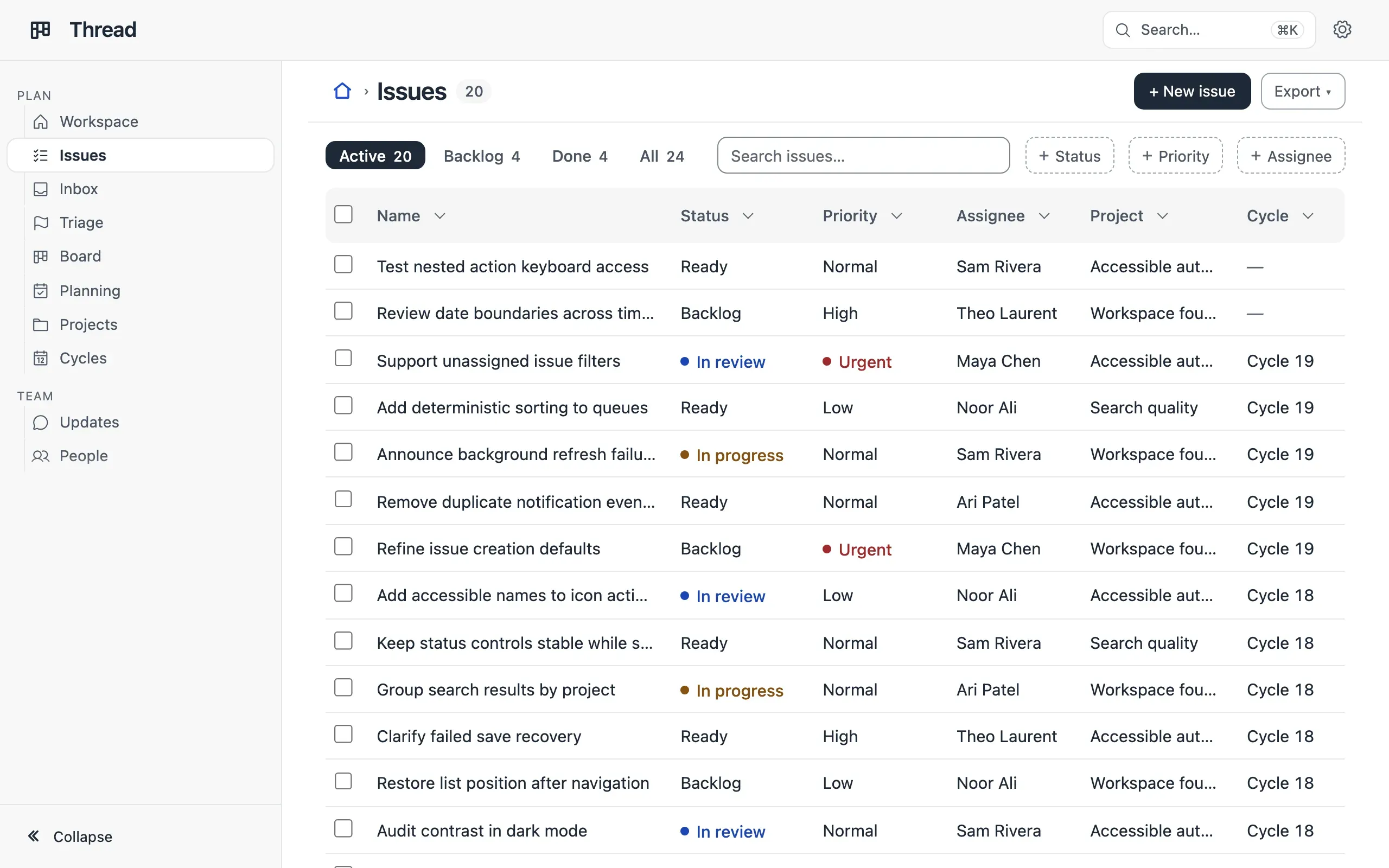
preset: 'tray'.Pick one
Section titled “Pick one”preset is mono (the default), canvas, iris, ink, sage, signal,
tray, or the id of a look the App registers. A typo is a type error.
Some looks carry named palettes: Iris has Coral; Signal has Sky, Mint and Lilac. Name one beside the look:
ui: { theme: { preset: 'iris', palette: 'coral' } },The App’s choice is a default: a reader can pick another look, palette and System/Light/Dark under Preferences, kept in their browser.
Adjust one
Section titled “Adjust one”ui: { theme: { accent: '#2563eb', radius: '8px' } },Four tokens, accent, accentSoft, radius and font, dress whichever look
is worn, down to the first series of its charts. Mono keeps its square
corners. Grounds and inks are not offered; for more, register a look.
Make your own
Section titled “Make your own”A look is data: defineTheme, built on one of the seven.
import { defineTheme } from 'tablewalk/app';
export const meridian = defineTheme({  id: 'meridian', label: 'Meridian', base: 'canvas',  light: { surface: '#ffffff', text: '#1f2a24', accent: '#1d6a5a', borderControl: '#7e8980' },  dark: { surface: '#1b2420', text: '#eef2ee', accent: '#7fd1b9', borderControl: '#6f8078' },  palettes: [{ id: 'mint', label: 'Mint', light: { accent: '#225544' }, dark: { accent: '#aaddcc' } }],  fonts: { heading: '"Iowan Old Style", Palatino, Georgia, serif' },  radii: { control: '6px', field: '6px' },});
// app.ts (excerpt)ui: { customThemes: [meridian], theme: { preset: 'meridian' } },| Rule | |
|---|---|
base |
One of the seven (default mono); only the roles you name override it. |
light, dark |
Six-digit hex colours; surface, text and accent are required. |
borderControl |
A field’s edge: should reach 3:1 on surface and background. |
palettes |
Up to 20 partial overrides; default is reserved for the original colours. defaultPalette picks one. |
fonts |
ui, data, heading, code: installed faces only, nothing is fetched. |
radii |
control, field: at most 8px. |
| Limits | At most 20 looks per App, each with a unique lowercase id. |
Startup warns, without refusing, when a colour falls under 4.5:1 for text or 3:1 for a field’s edge. The whole contract is docs/theming.md.
Display type (preview)
Section titled “Display type (preview)”?craft=bold on an App’s address sets a dashboard’s figures, a record’s head
and a landing’s headline louder, in the look’s heading face; ?craft=off
turns it off.