Composing the navigation and shell
The shell is the first thing a reader sees and carries more of an App’s look than any section: a chosen look, a mark, and a menu arranged the way the day runs. Depot is the worked example.
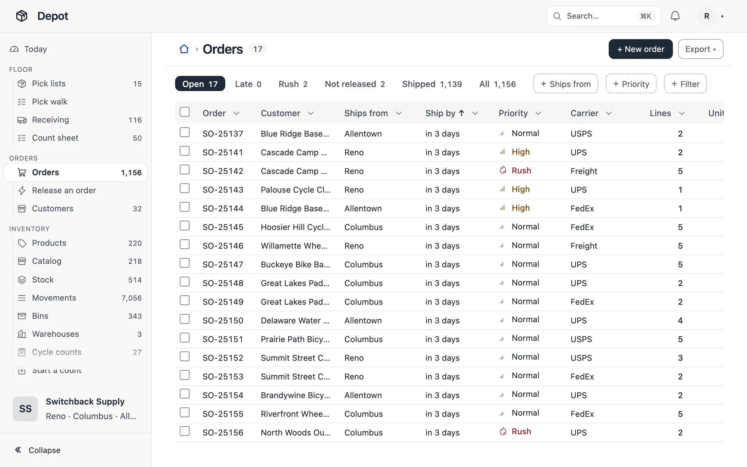
- Always, choose a look with
ui.theme.preset; the default (Mono) is the unstyled fallback — depot/app.ts:47. - Always, give the App a
logomark and every view aniconof what it lists, nevertable— app.ts:46, depot/views.ts:222. - When the menu has more than six entries, group it with
navGroupin the order the work runs, each group with an icon — depot/navigation.ts:10. - When people pick a list by how much is in it,
shell.counts: true— app.ts:48. - When the menu is long, the side placement with
rail: true, so a folded menu keeps its icons; when it is a few groups,placement: 'top'— app.ts:48, compass/app.ts:19. - When the first entry is a dashboard, give it the menu word people say
(
{ view, label: 'Today' }) — navigation.ts:9. - When roles start in different places,
homeby role — app.ts:43.
The looks are in Looks; the keys in Navigation and the shell.